For this project I was put into a team of three designers, where we were tasked to design a family of three bathroom faucets that looked like it was produced by the company Vespa. I was tasked with designing the single handle faucet while the 8 inch widespread and standard 4 inch faucets were designed by my team mebers. To accomplish this, we had to research Vespa’s design language and apply that to our family of faucets.
This project emphasized design research, development, and implementation. It also stressed the importance of teamwork and cooperation within a team of designers to achieve a common goal.
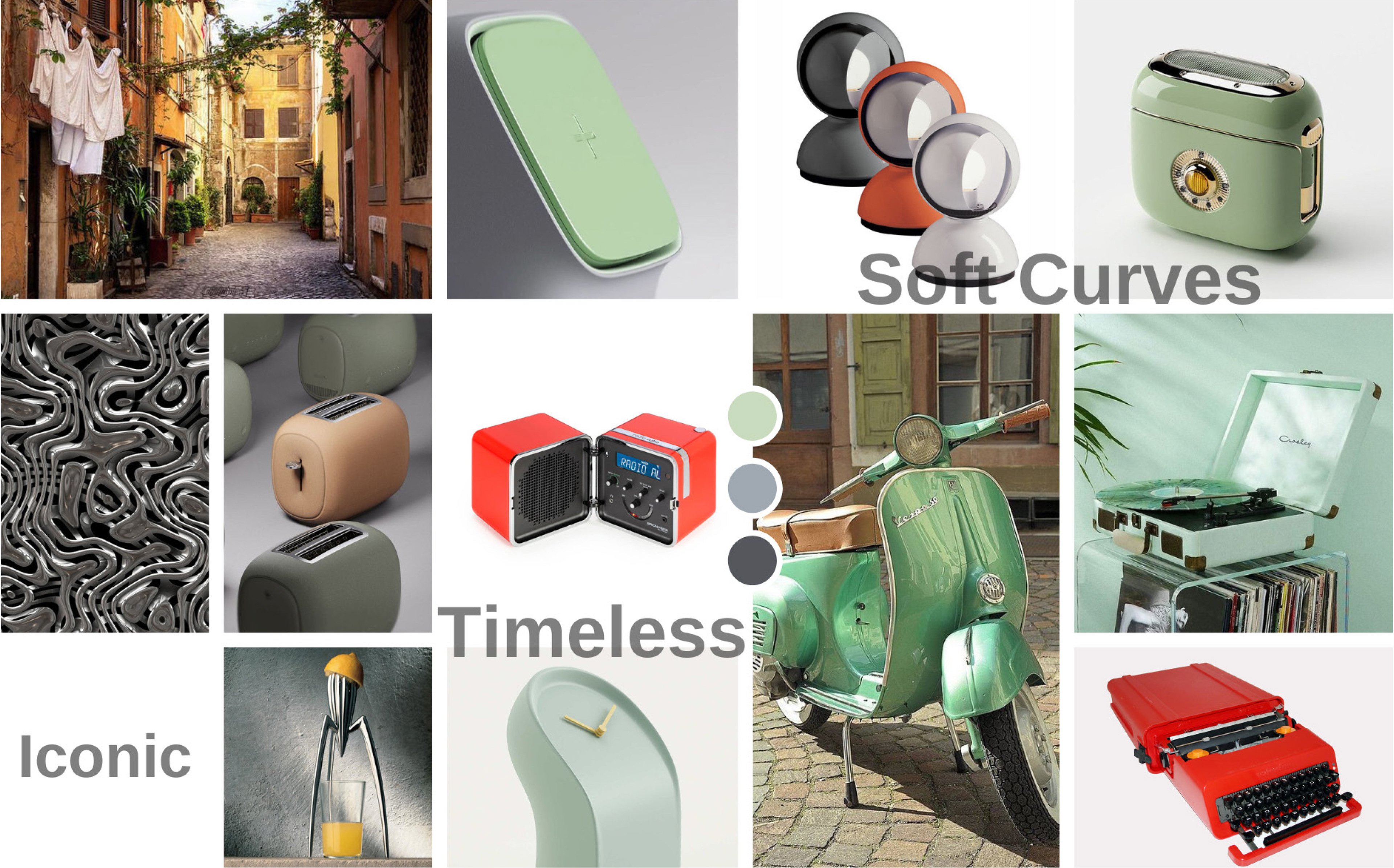
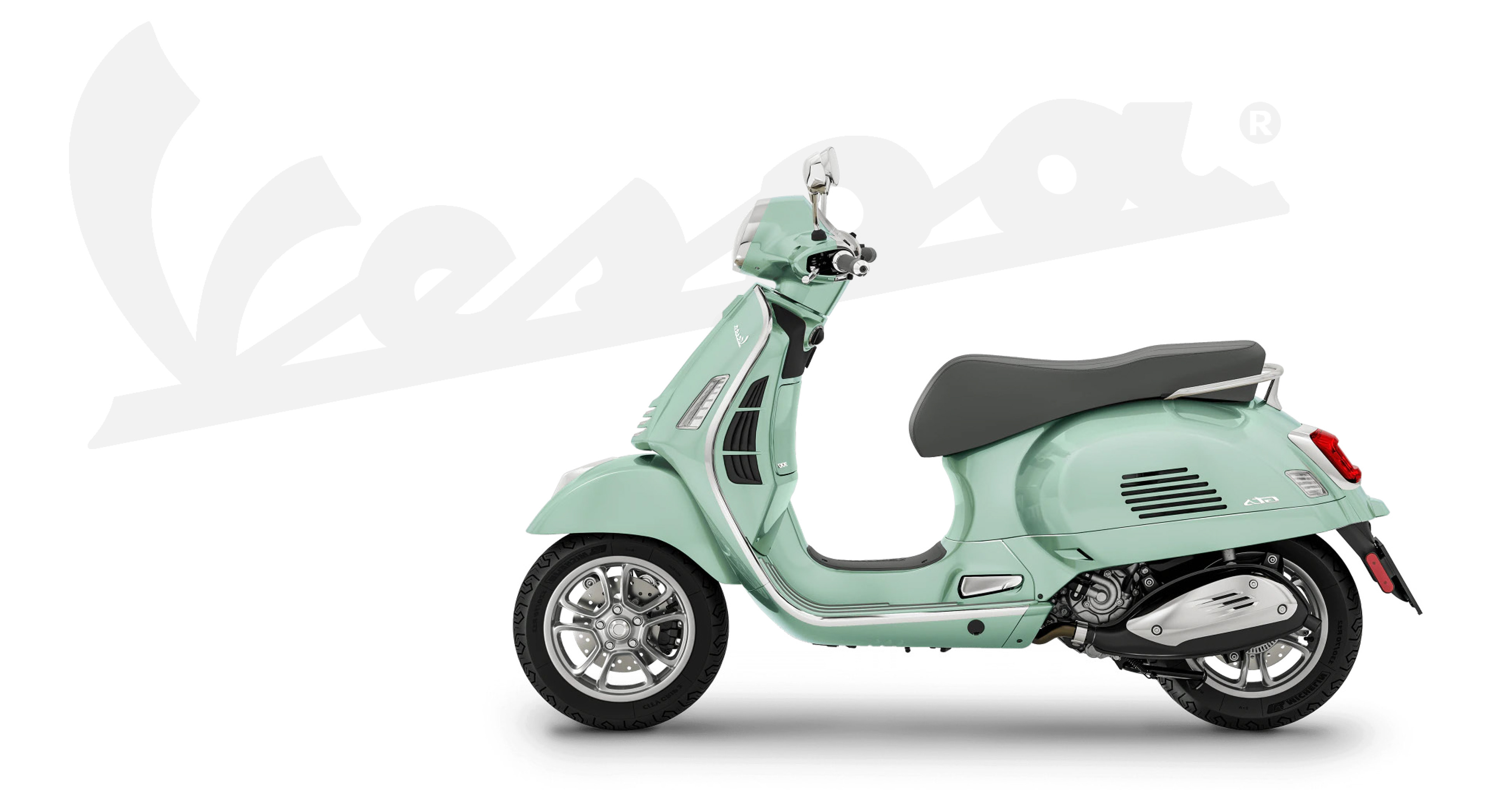
Vespa Brand Language
- Vespa is known for its playful and colorful Italian design cues.
- The design has remained virtually unchanged for almost a century, making it an immediately recognizable pop culture icon that’s captivated people from all around the world.
- Vespa’s iconic design is sleek, yet bulbous resembling that of a wasp, which is where it got its name. (Wasp translates to “vespa” in Italian).
- Vespas convey a sense of adventure and fun, encouraging its riders to customize them and make it personal.
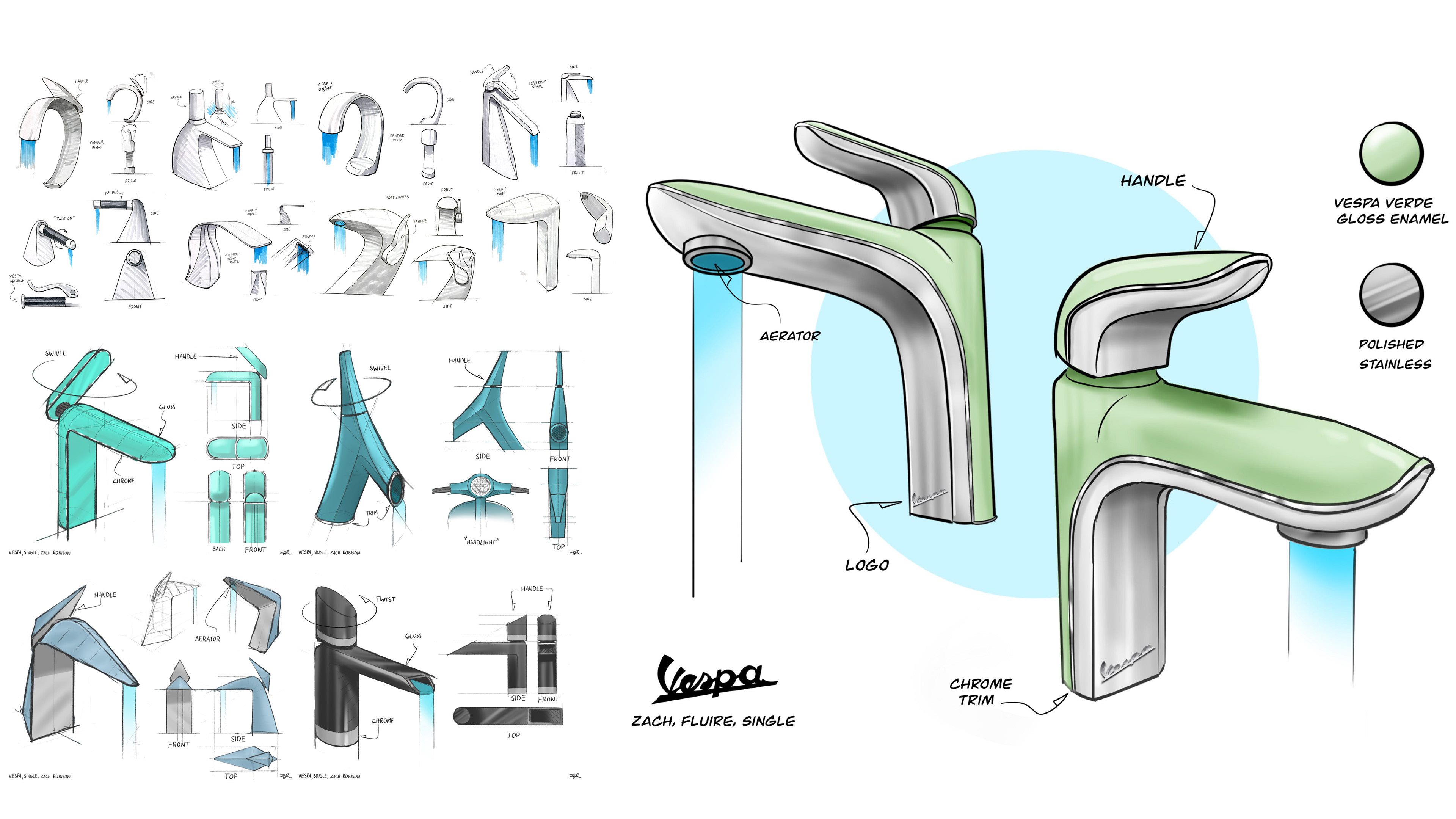
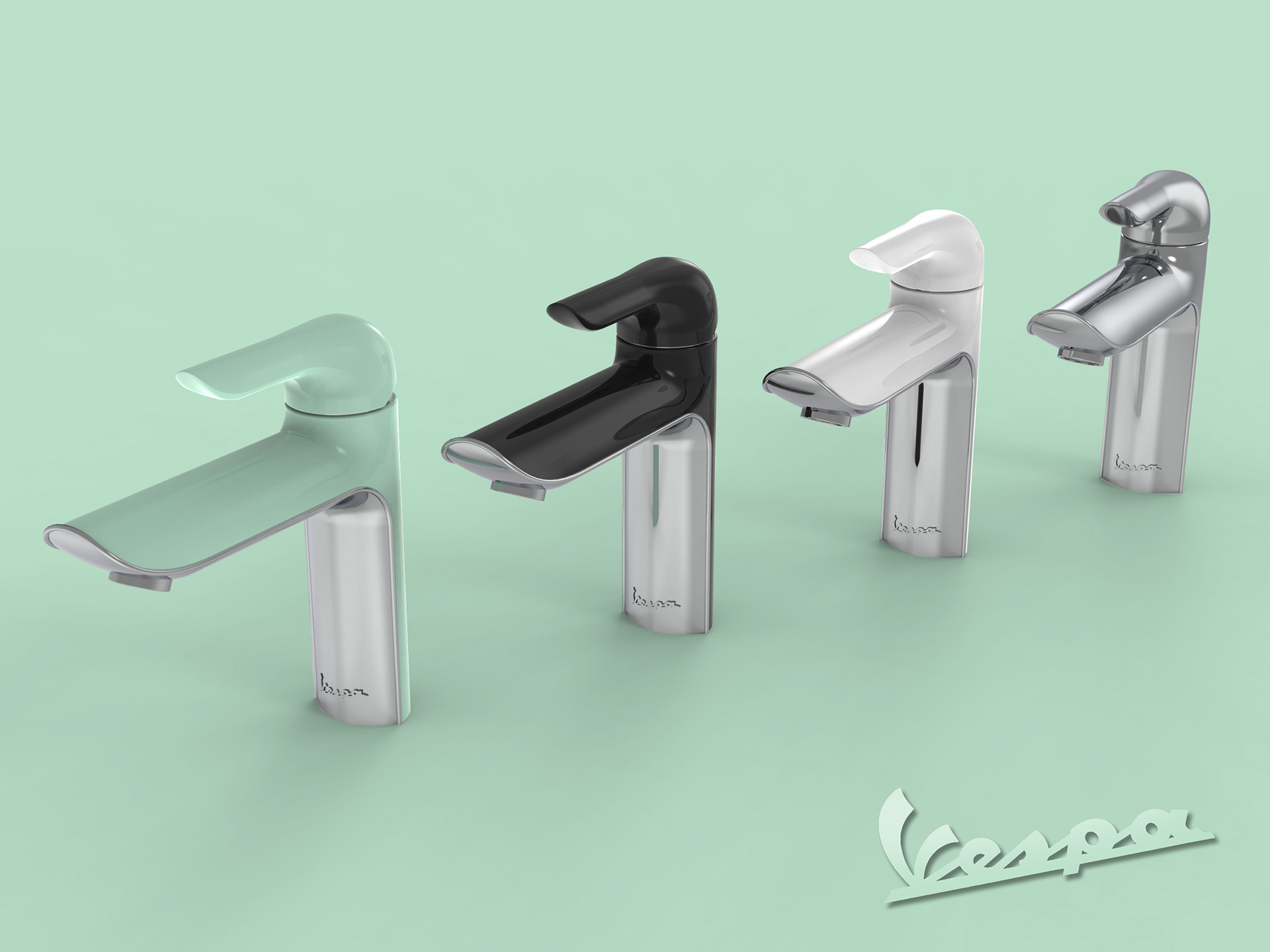
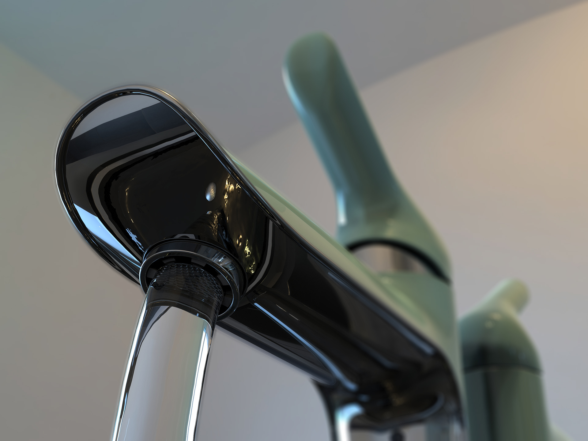
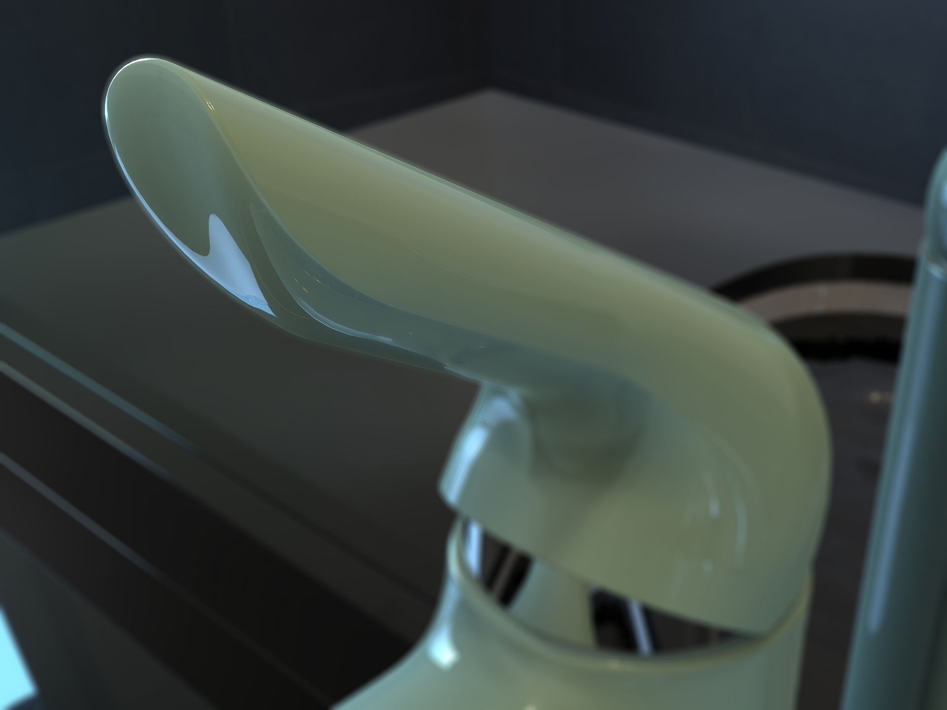
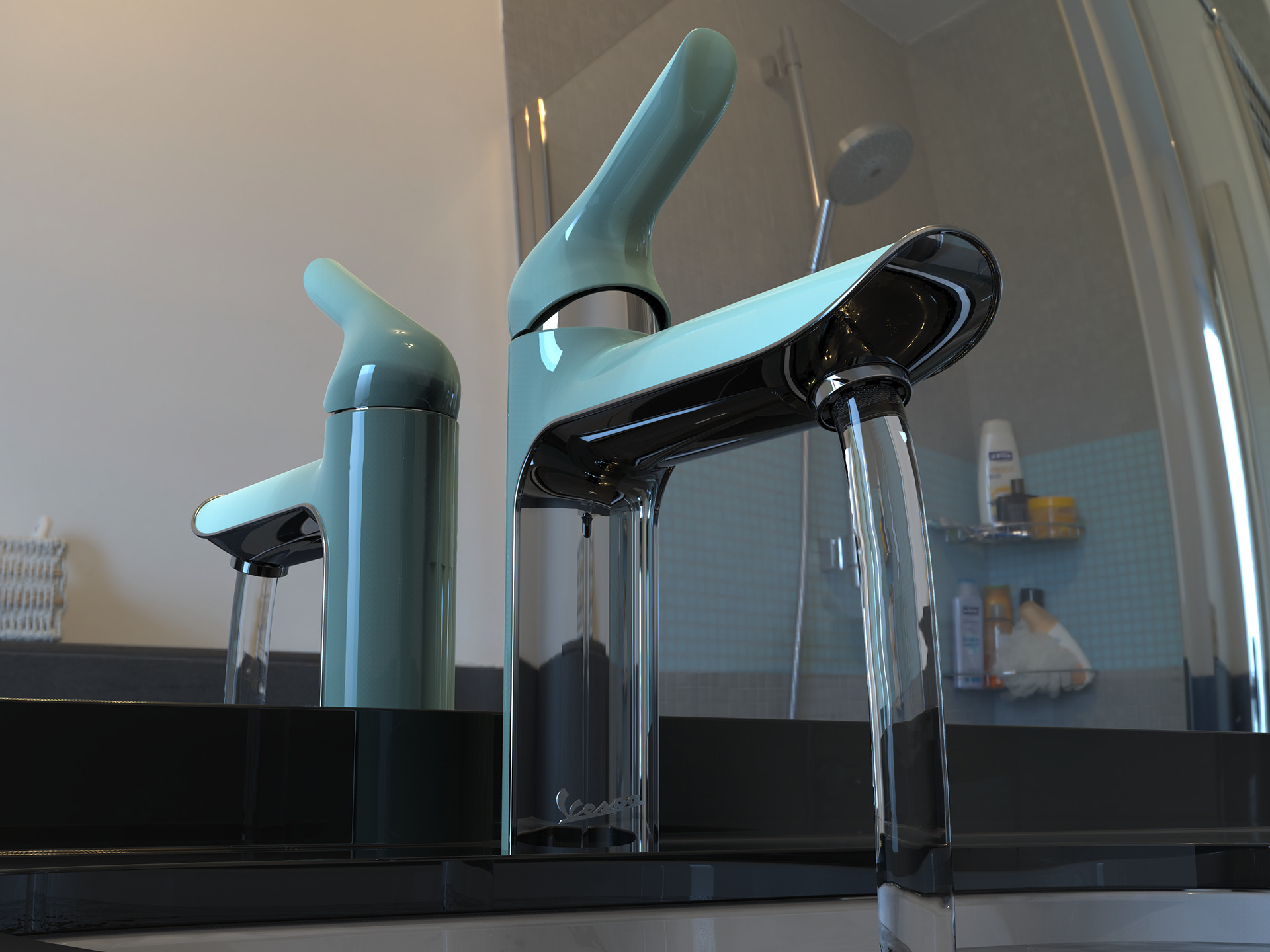
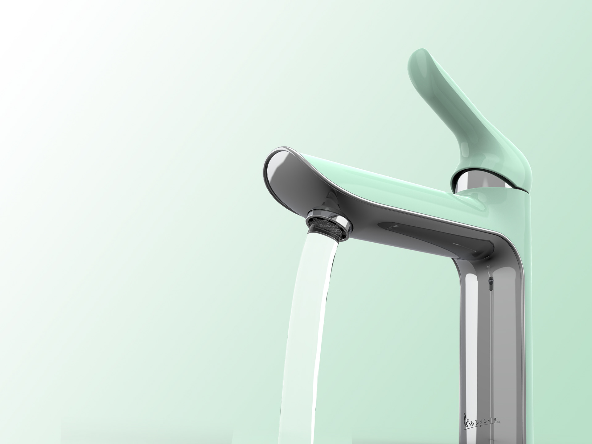
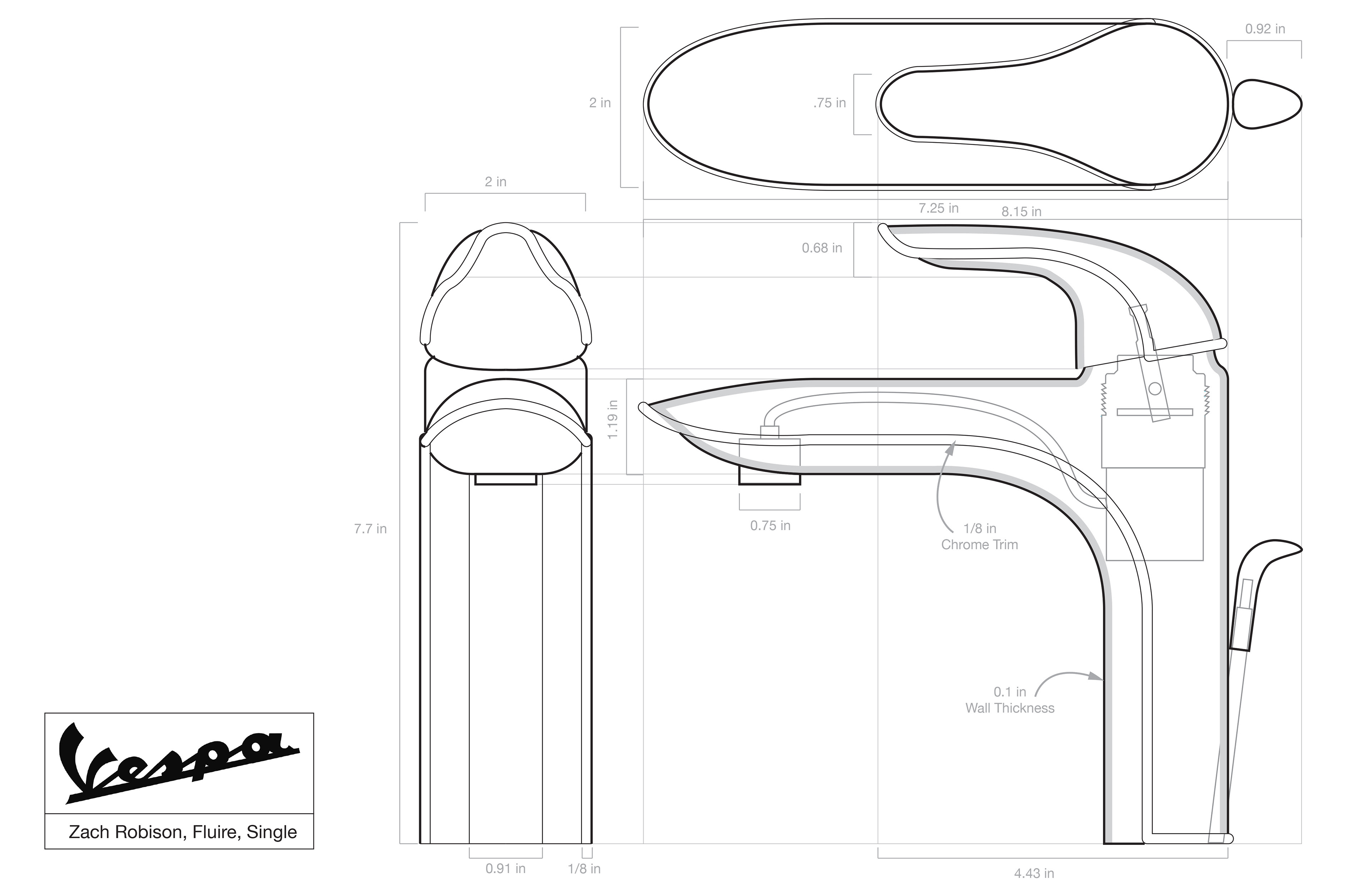
After extensive initial ideation, my team and I settled on this striking and classy design, incorporating Vespa's signature 'Verde' color. We named the collection 'Fluire,' Italian for 'flow,' as the soft curves of the faucet mimic the sleekness of a Vespa scooter.
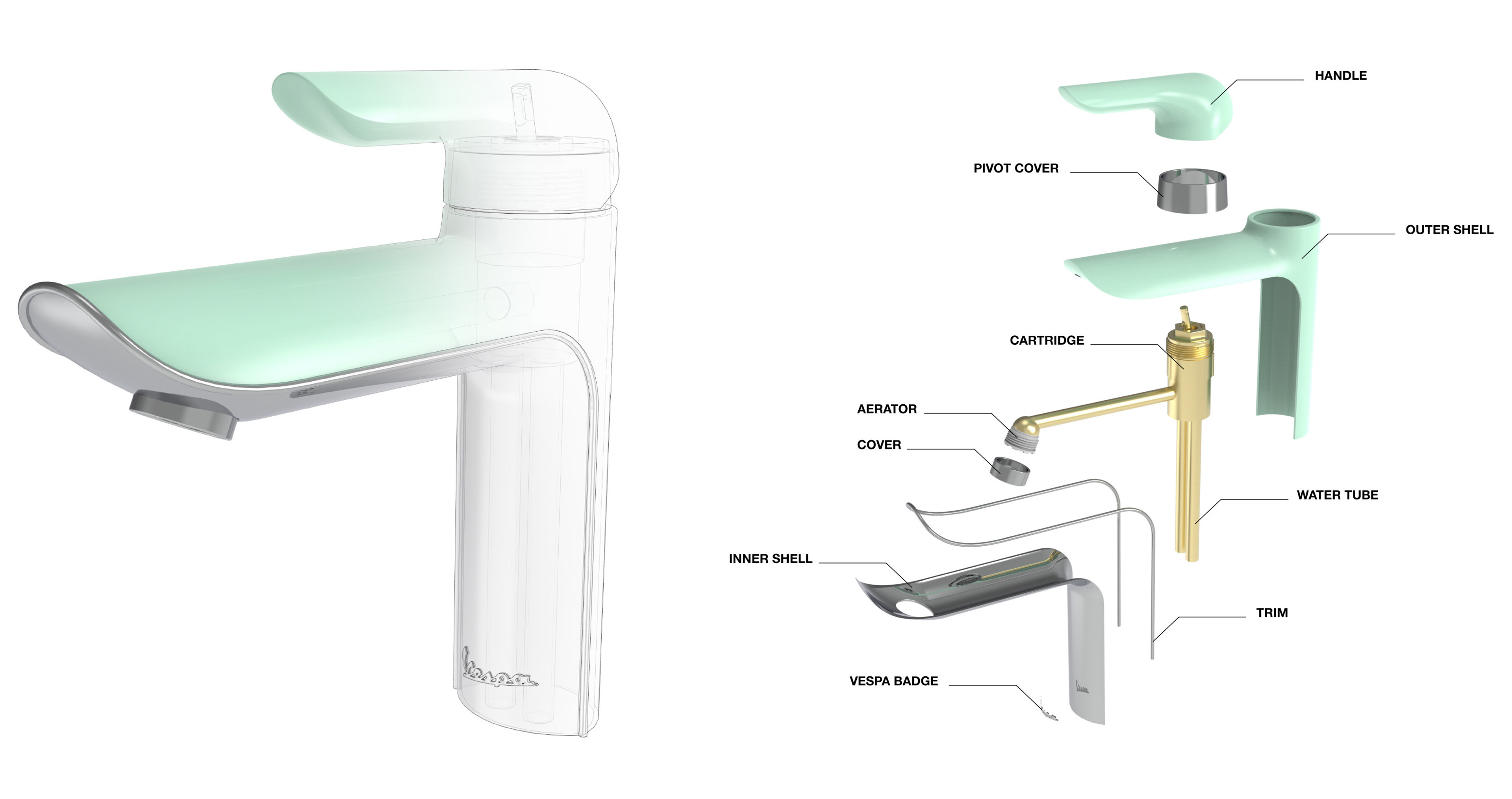
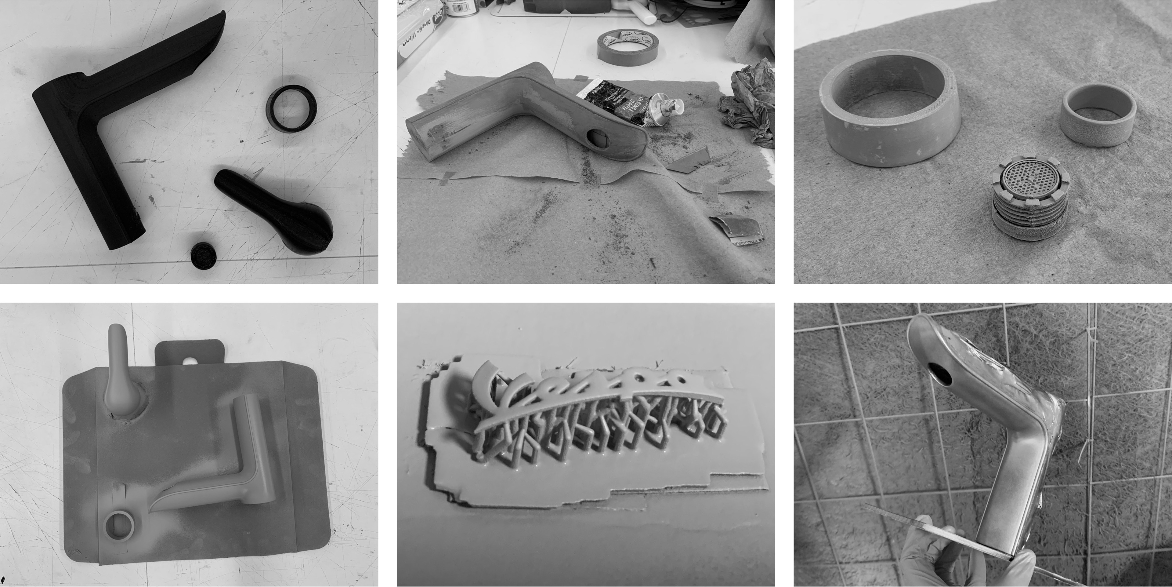
After modeling the faucet in SolidWorks, I 3D printed, finished, and painted a scale model, bringing the design to life.
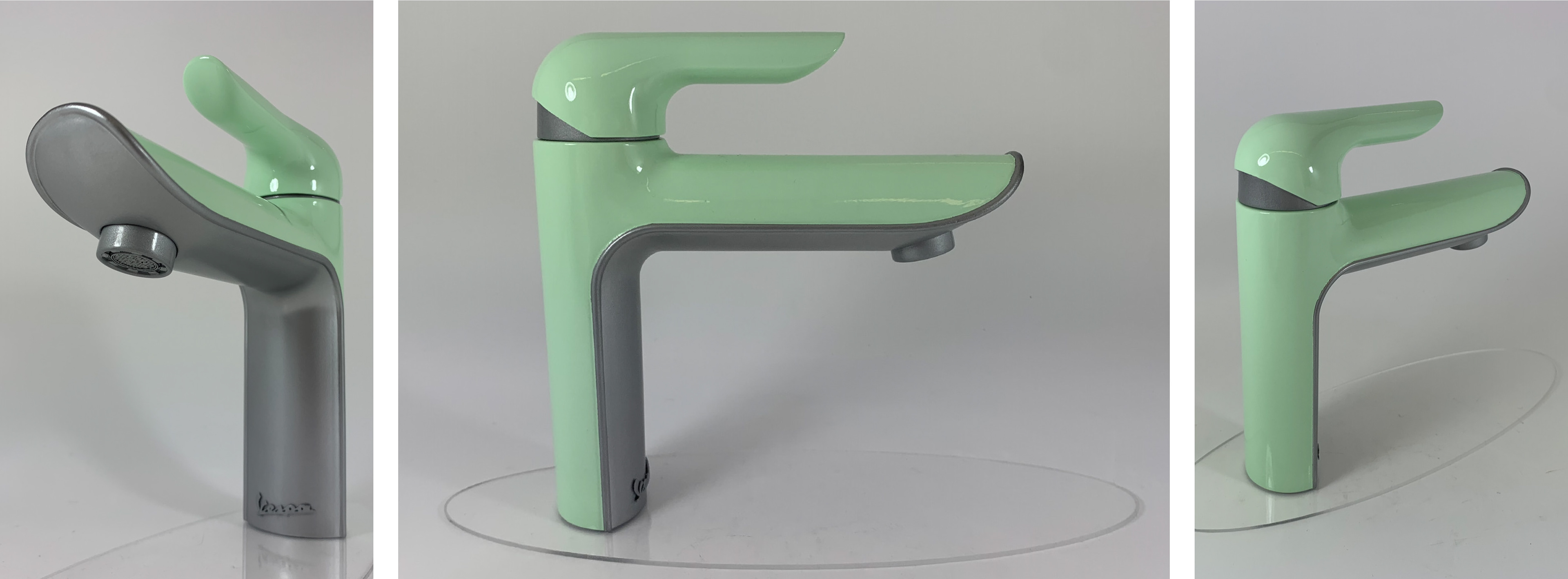
Along with the scaled model, I also rendered in-context images of the faucet using KeyShot.